
THE BRAND
Heroica is a brazilian healthy food brand that was founded in Florianópolis, SC. With a diverse product line, it aims to show that it's possible to eat well without sacrificing taste and convenience. In addition to promoting healthy eating, the brand encourages small habit changes to foster well-being and a more active, healthy lifestyle.
A MARCA
Heroica é uma marca de alimentos saudáveis que nasceu em Florianópolis (Brasil). Com uma linha diversificada de produtos, quer mostrar que é possível comer bem sem abrir mão do sabor e da praticidade. Além da alimentação, a marca incentiva pequenas mudanças de hábitos para promover o bem-estar e um estilo de vida mais ativo e saudável.
SERVICES
Strategy, Naming, Visual Identity, Packaging.
CHALLENGE
After three years in the market, the brand found itself at a turning point. Striving to expand its reach and scale, the company realized the importance of finding a name that not only met registration and protection requirements but also resonated deeply with its purpose. Building upon the definition of the brand's new positioning, our challenge was to craft a name and visual identity that encapsulated the brand's values and propelled its growth.
DESAFIO
Após três anos no mercado, a marca se viu em um momento de mudanças. Buscando ganhar escala e abrangência, a empresa reconheceu a necessidade de encontrar um nome que fosse não só viável em termos de registro e proteção, mas também mais conectado com o seu propósito. Partindo da definição do novo posicionamento da marca, nosso desafio foi criar um nome e uma identidade visual que traduzissem os valores da marca e impulsionassem seu crescimento.
STRATEGY
During our immersion, we realized that promoting healthier eating and lifestyle was just the tip of the iceberg. The true essence of the brand lies in the journey of its founder, who chose to embark on entrepreneurship to pursue her dream. With this in mind, the brand emerges with a very clear purpose: to instigate a positive transformation in people's lives, inspiring them to believe in their potential and give their best every day.
ESTRATÉGIA
Na nossa imersão, entendemos que incentivar uma alimentação e um estilo de vida mais saudável era apenas a pontinha do iceberg. A verdadeira essência da marca está na jornada de sua idealizadora, que decidiu empreender para seguir seu sonho. Com isso em mente, a marca nasce com um propósito muito claro: gerar uma transformação positiva na vida das pessoas, inspirando-as a acreditarem no seu potencial e darem o seu melhor todos os dias.


NAMING
Heroica embodies the courageous and inspiring personality of the brand (and its founder), directly linked to the hero archetype. A name that speaks of journey, determination, and achievement, positioning the brand as a source of inspiration and a role model to follow. With a strong and grandiose sound, Heroica is vibrant, full of energy and vitality, perfectly capturing the essence of the brand.
Heroica embodies the courageous and inspiring personality of the brand (and its founder), directly linked to the hero archetype. A name that speaks of journey, determination, and achievement, positioning the brand as a source of inspiration and a role model to follow. With a strong and grandiose sound, Heroica is vibrant, full of energy and vitality, perfectly capturing the essence of the brand.
NAMING
Heroica representa a personalidade corajosa e inspiradora da marca (e de sua idealizadora), diretamente relacionada ao arquétipo do herói. Um nome que fala de jornada, determinação e conquista, posicionando a marca como uma fonte de inspiração e um exemplo a ser seguido. Com uma sonoridade forte e grandiosa, Heroica é vibrante, cheia de energia e vitalidade, capturando perfeitamente a essência da marca.
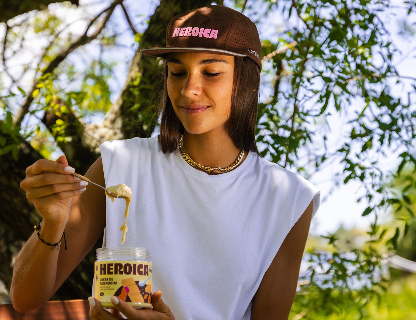
LOGO
The Heroica logo embodies the strength of the hero archetype through its typography, conveying presence and personality.
At the same time, its tall and customized style adds a sense of crispness, making it more playful and unique. The rounded corners create a friendly and approachable feel, reinforcing the brand’s core values.
LOGO
A logo da Heroica incorpora a força do arquétipo do herói em sua tipografia, transmitindo presença e personalidade. Ao mesmo tempo, sua estética tall e customizada adiciona um toque de crocância, tornando-a mais divertida e original. Os cantos arredondados conferem um aspecto amigável e acessível, alinhado à proposta de valor da marca.
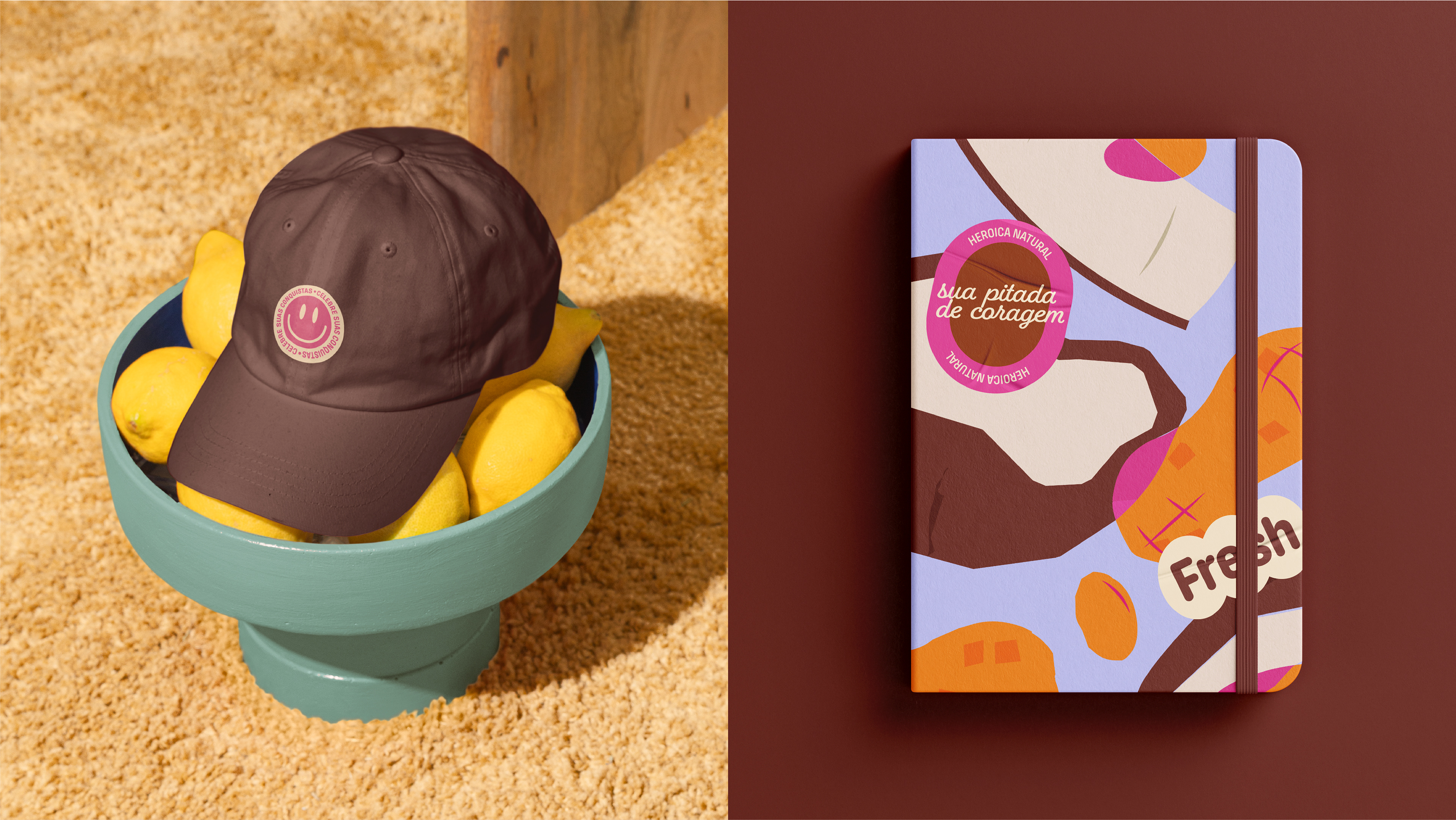
ILUSTRATIONS
The illustrations enhance the brand’s fun and vibrant identity, showcasing each product’s ingredients in a playful and unexpected way. The intersections between elements symbolize the connection between ingredients, emphasizing how each mix brings a unique and delicious flavor. Pink was chosen as the highlight color for these intersections, adding contrast and balance within the color palette.
ILUSTRAÇÕES
As ilustrações reforçam a identidade fun da marca, apresentando os ingredientes de cada produto de maneira lúdica e surpreendente. As interseções entre os elementos visuais representam a conexão entre os ingredientes, destacando a riqueza de cada mix e seu sabor único. O rosa foi escolhido como cor de destaque para essas interseções, proporcionando contraste e equilíbrio dentro da paleta cromática.

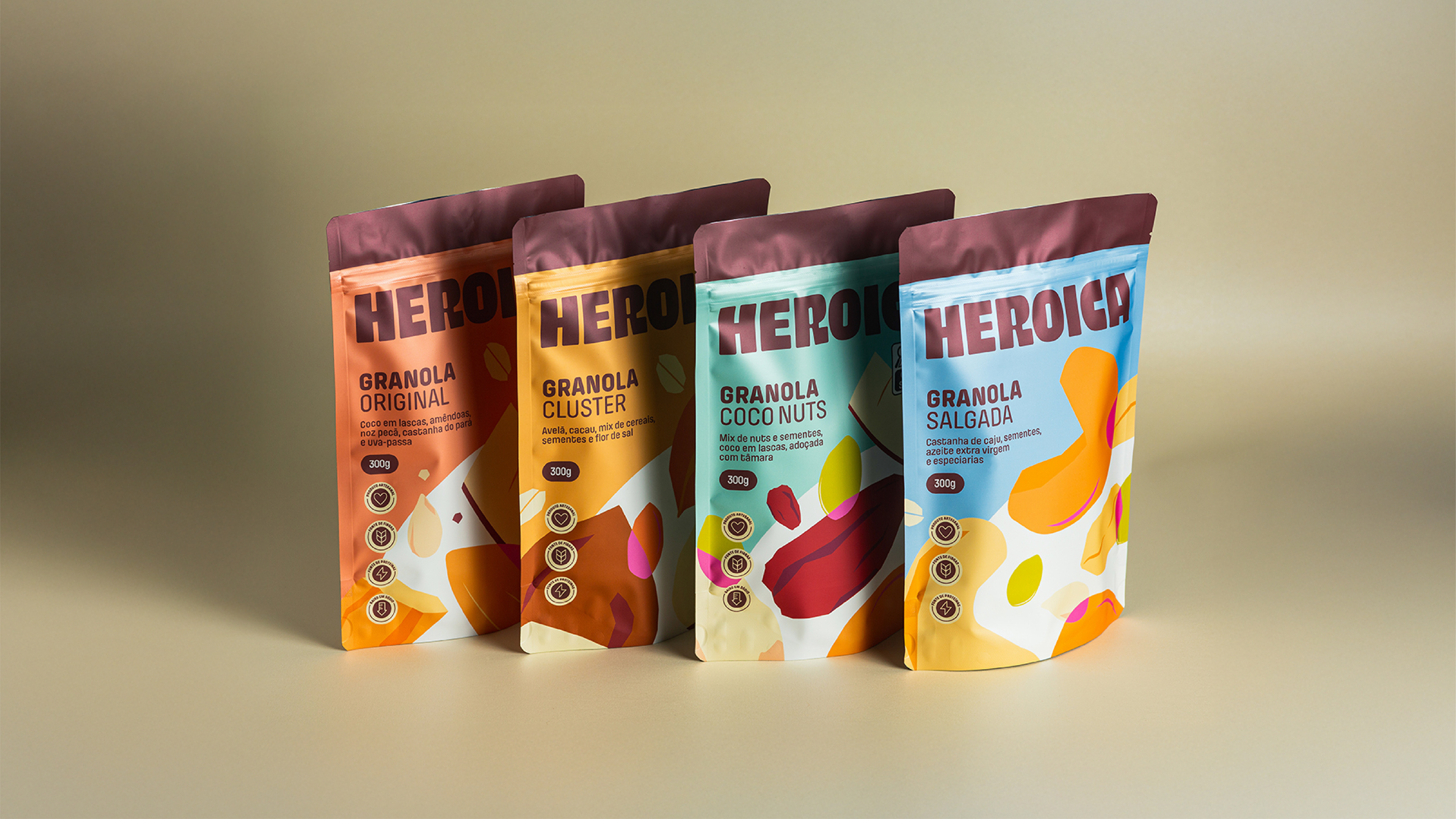
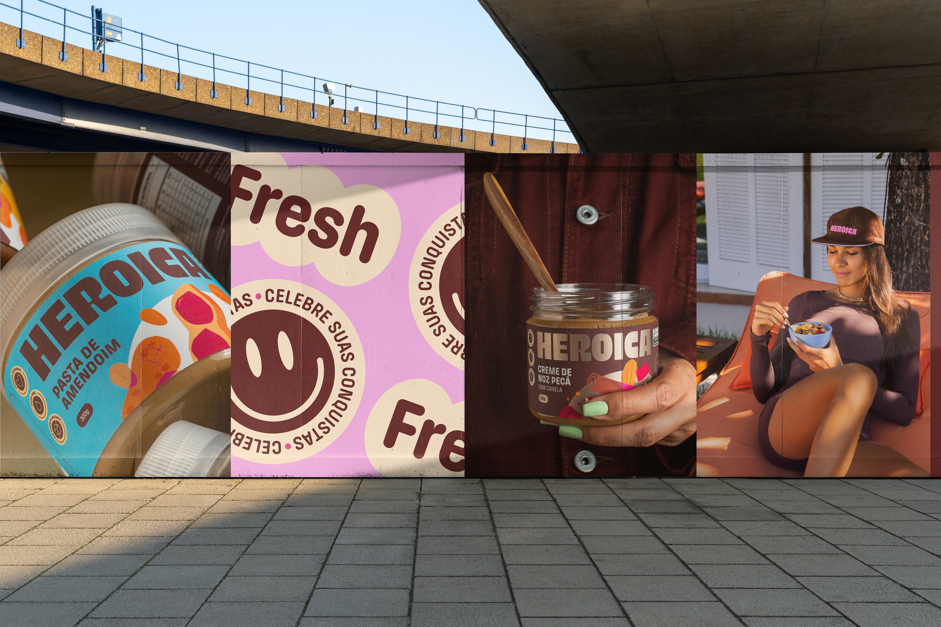
PACKAGING
The packaging design aimed to ensure flexibility while maintaining consistency across different formats and potential future brand expansions. Given the wide range of colors in the illustrations, background colors were carefully selected to provide contrast and shelf impact, linking each flavor to a distinct hue. The semicircle element within the illustrations reinforces the visual hierarchy and organizes the composition. Layout and iconography patterns were established to align with the logo’s rounded aesthetic. For the premium nut butter line, darker tones and gold finishes were incorporated into the logo and key details, adding a refined touch and ensuring a cohesive yet diverse visual system.
EMBALAGENS
O design das embalagens foi concebido para garantir flexibilidade sem comprometer a consistência da identidade visual, independentemente do formato. Considerando a diversidade cromática das ilustrações, as cores de fundo foram selecionadas estrategicamente para gerar contraste e destaque nas gôndolas, associando cada sabor a uma cor específica. O meio círculo, presente nas ilustrações, estabelece hierarquia visual e estrutura a composição. Além disso, padrões de diagramação e iconografia foram definidos para manter a coesão com o logo e seu aspecto arredondado. Para a linha premium de pastas, foram adotadas cores mais escuras e detalhes em dourado no logo e em algumas informações da embalagem, garantindo uma percepção sofisticada e um mix visualmente coeso e atrativo.

Natalia Favero - Project Manager
Rafaela Sotuyo - Brand Strategist
Hemelyn Haertel - Brand Strategist
Lucas Guidi - Art Director
Beatriz Bastos - Illustrator
Diony de Lara - Motion Designer
Luísa Colombi - Photographer
Ed Andrade - Photographer
Virgínia do Vale - Producer