Hogo (保護) is a Japanese word that most commonly means to protect, care for, shelter, and safeguard.
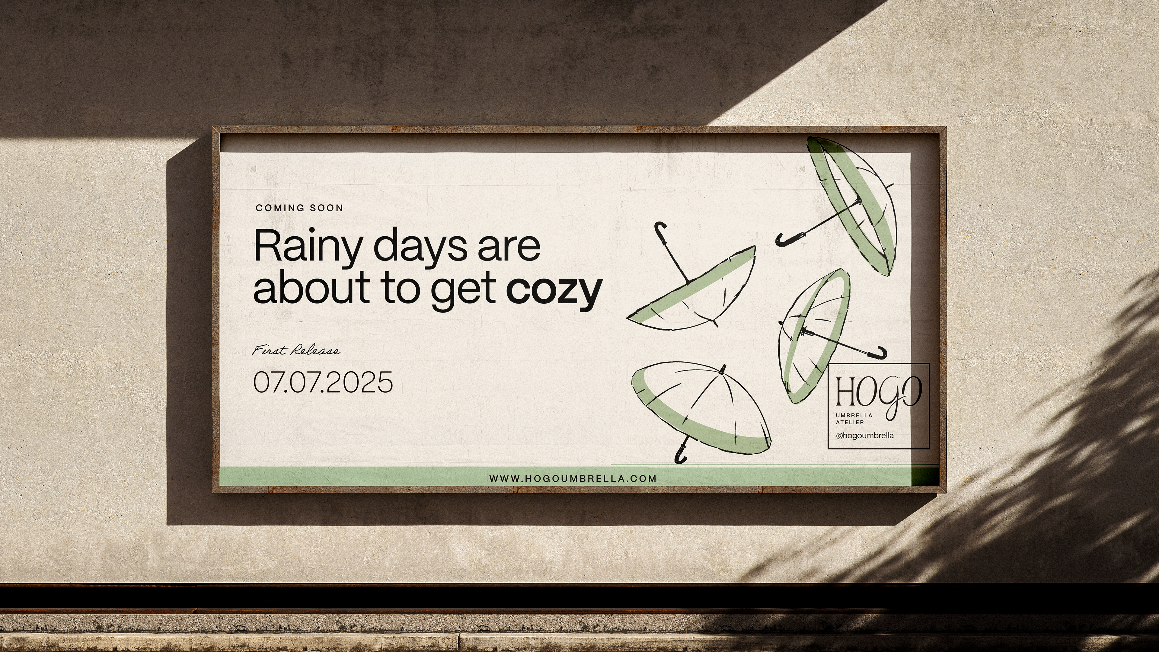
Rainy days are often associated with inconvenience, grey skies, and an umbrella chosen in a hurry. Hogo was built around the idea of bringing color and beauty to rainy days while making people feel safe, calm, and sheltered underneath an umbrella. It encourages people to intentionally choose Hogo as an object worth keeping, something that feels good in the hand, inspires trust, and becomes part of someone’s wardrobe. Hogo turns rain into something a little more cozy, intimate, and even romantic.
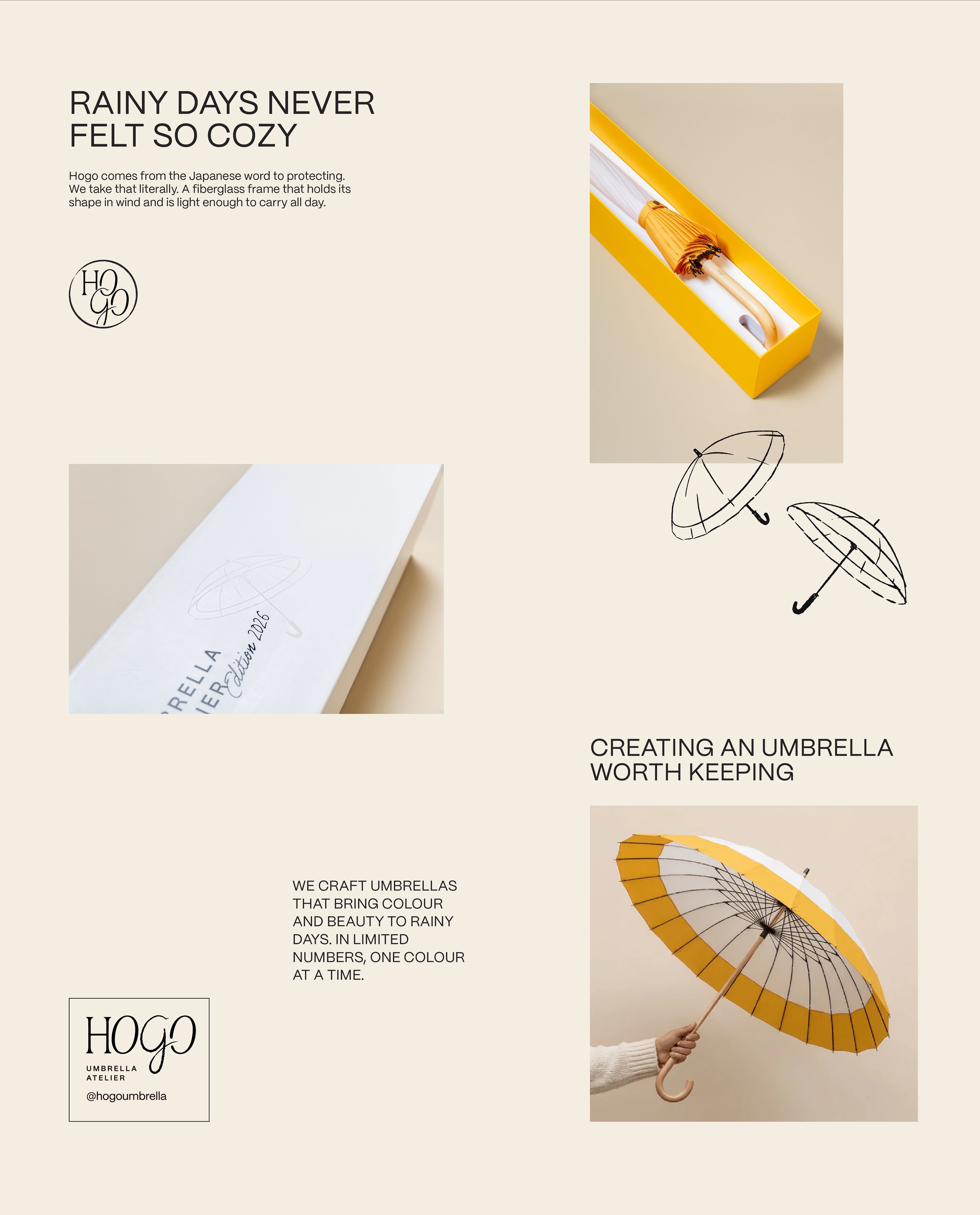
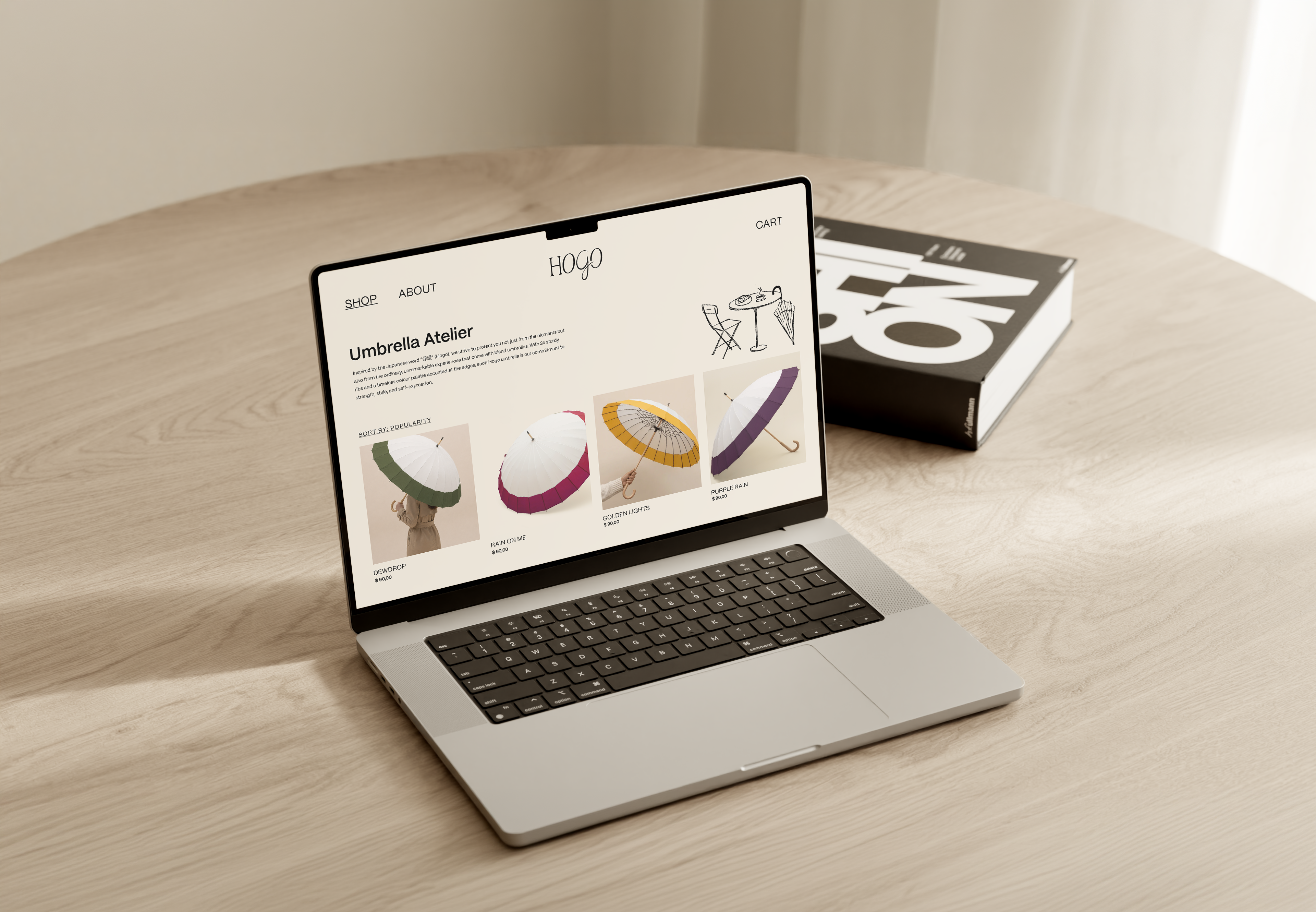
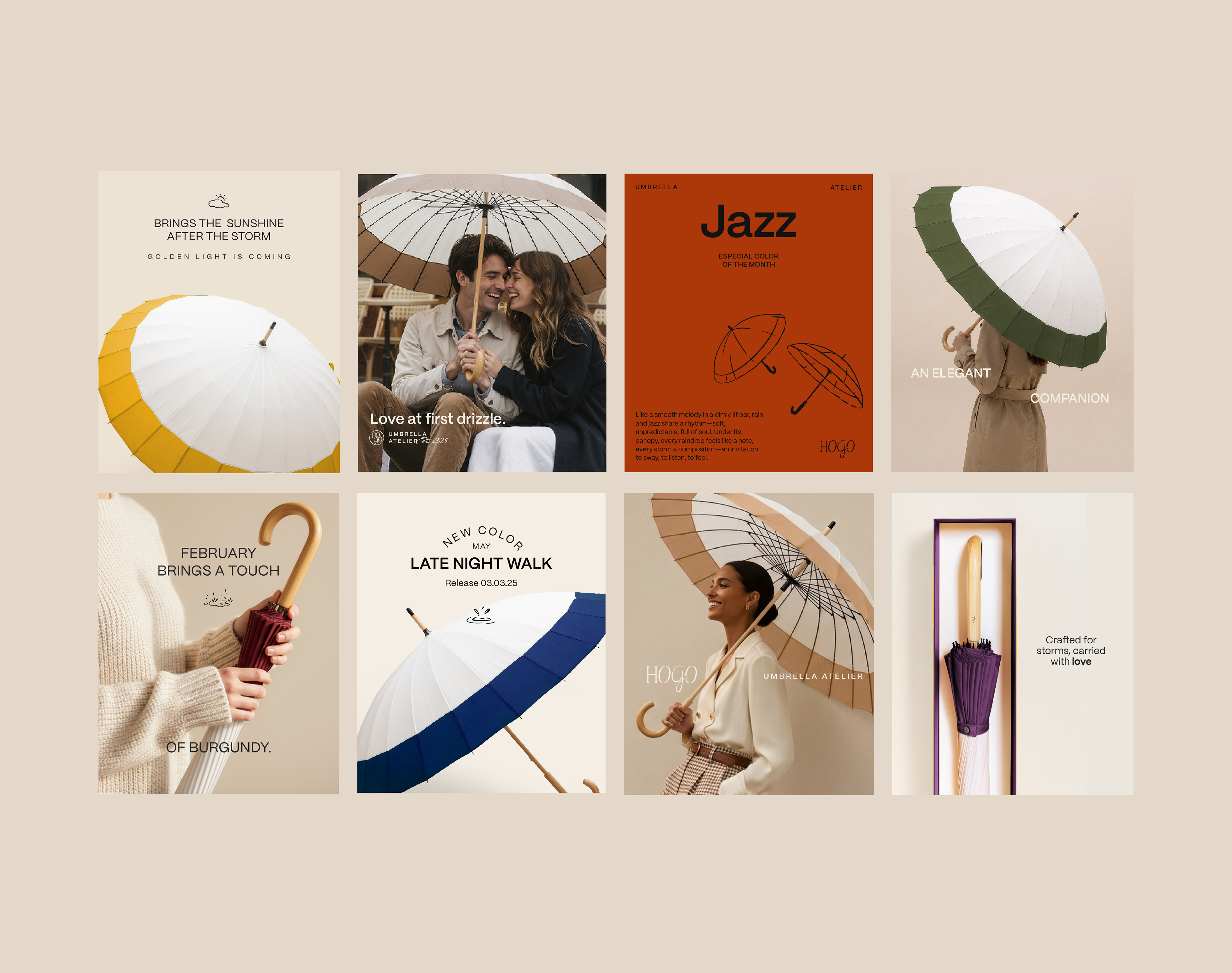
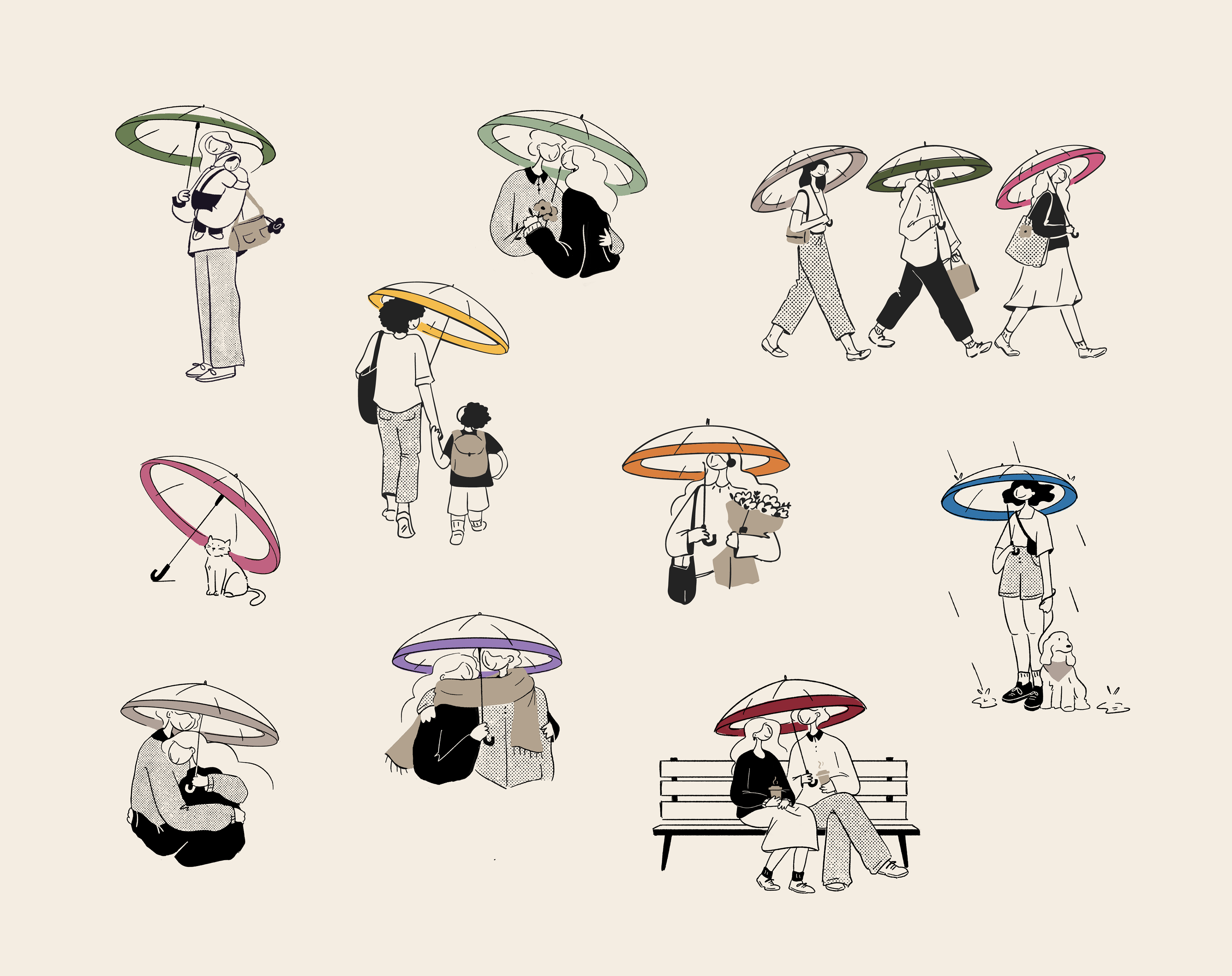
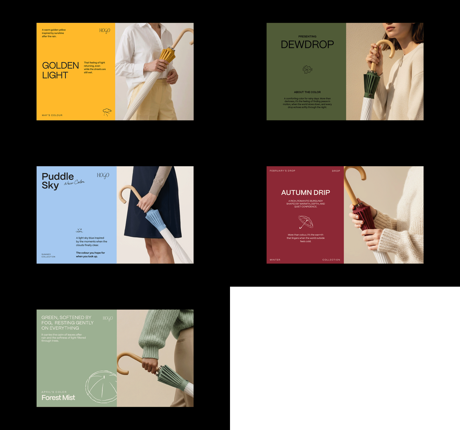
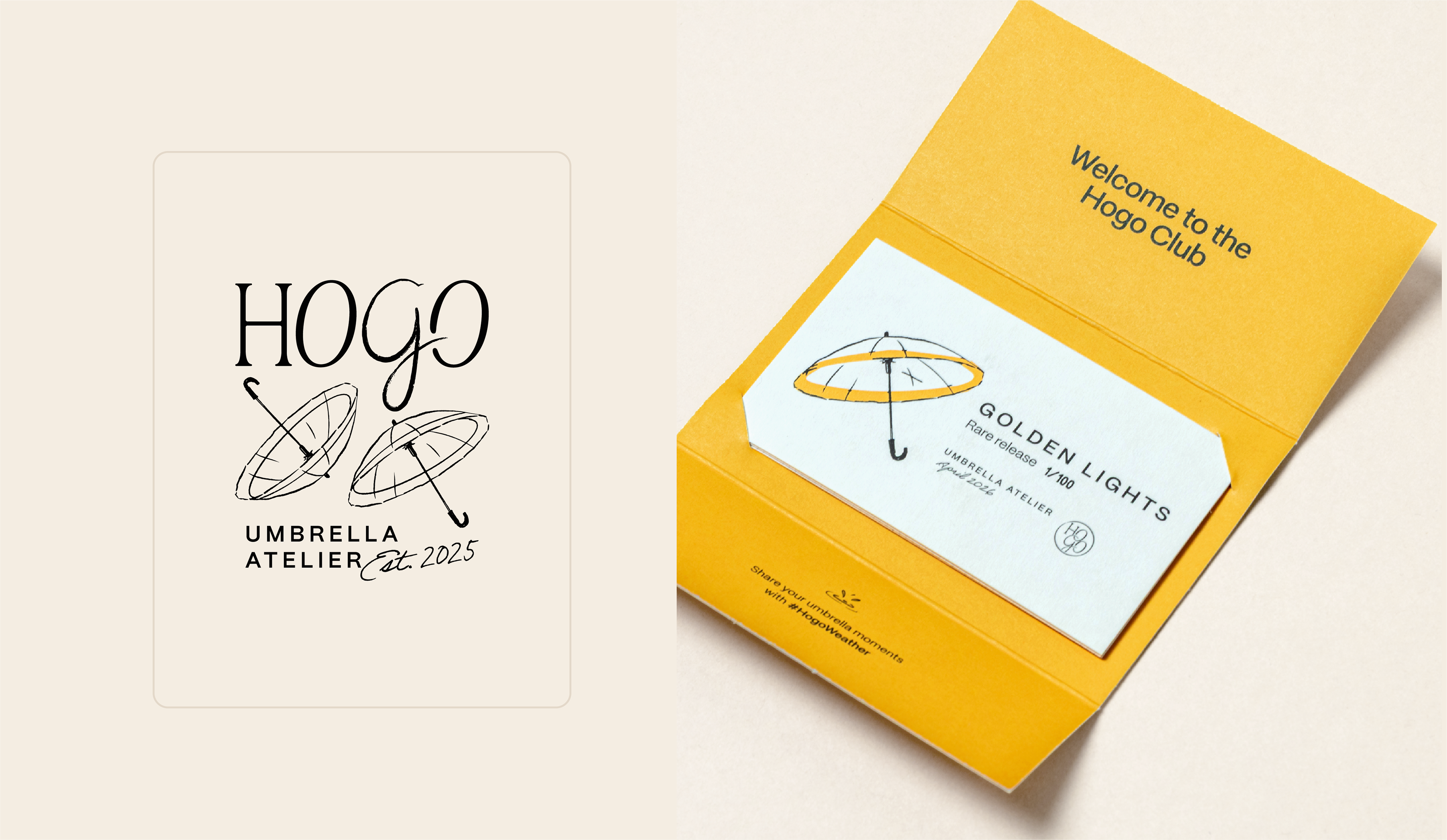
Hogo's visual identity was built around quiet elegance, combining sophistication, warmth, and a human touch, qualities rarely associated with rainy weather. The umbrellas already carried a distinctive signature: a predominantly beige and warm parts with subtle touches of colour along the edges. The identity follows the same principle, using a basepalette of neutral tones and introducing accent colors only through illustrations and selected details.
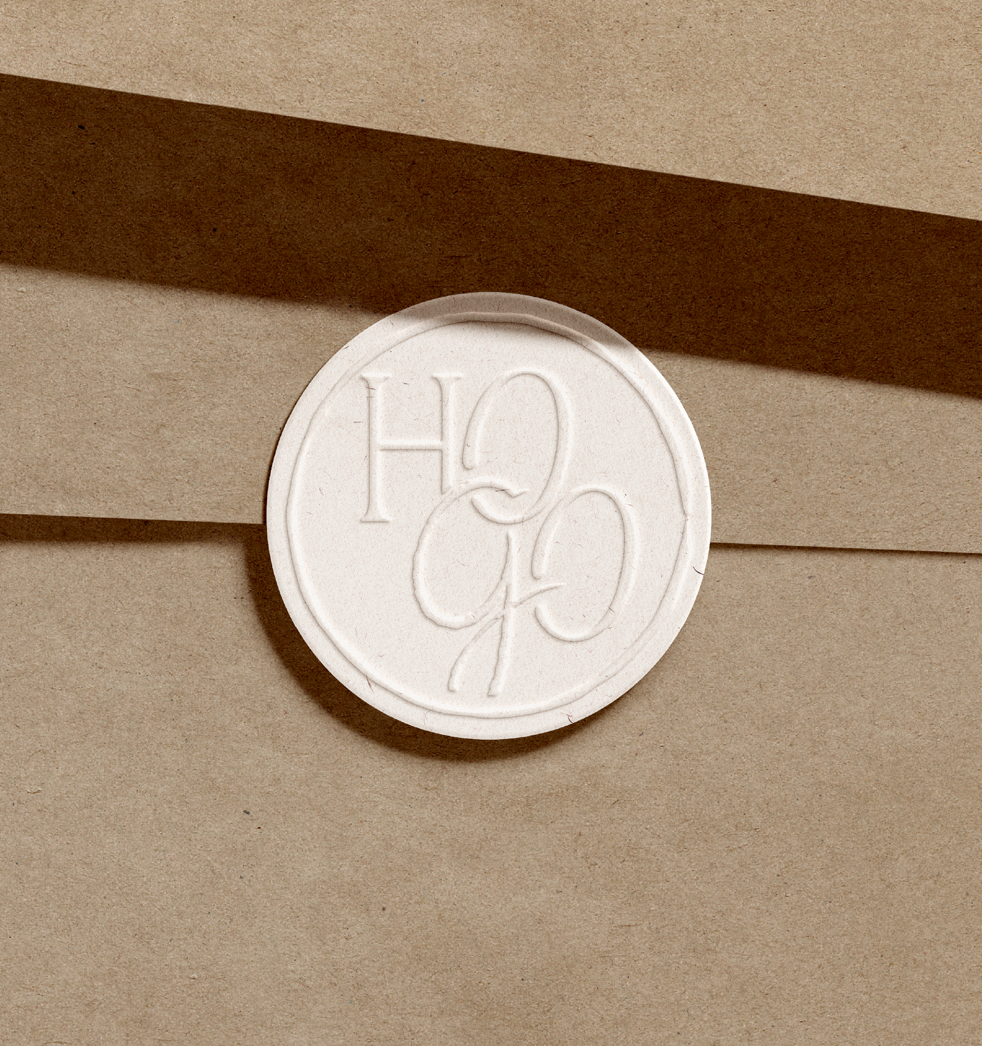
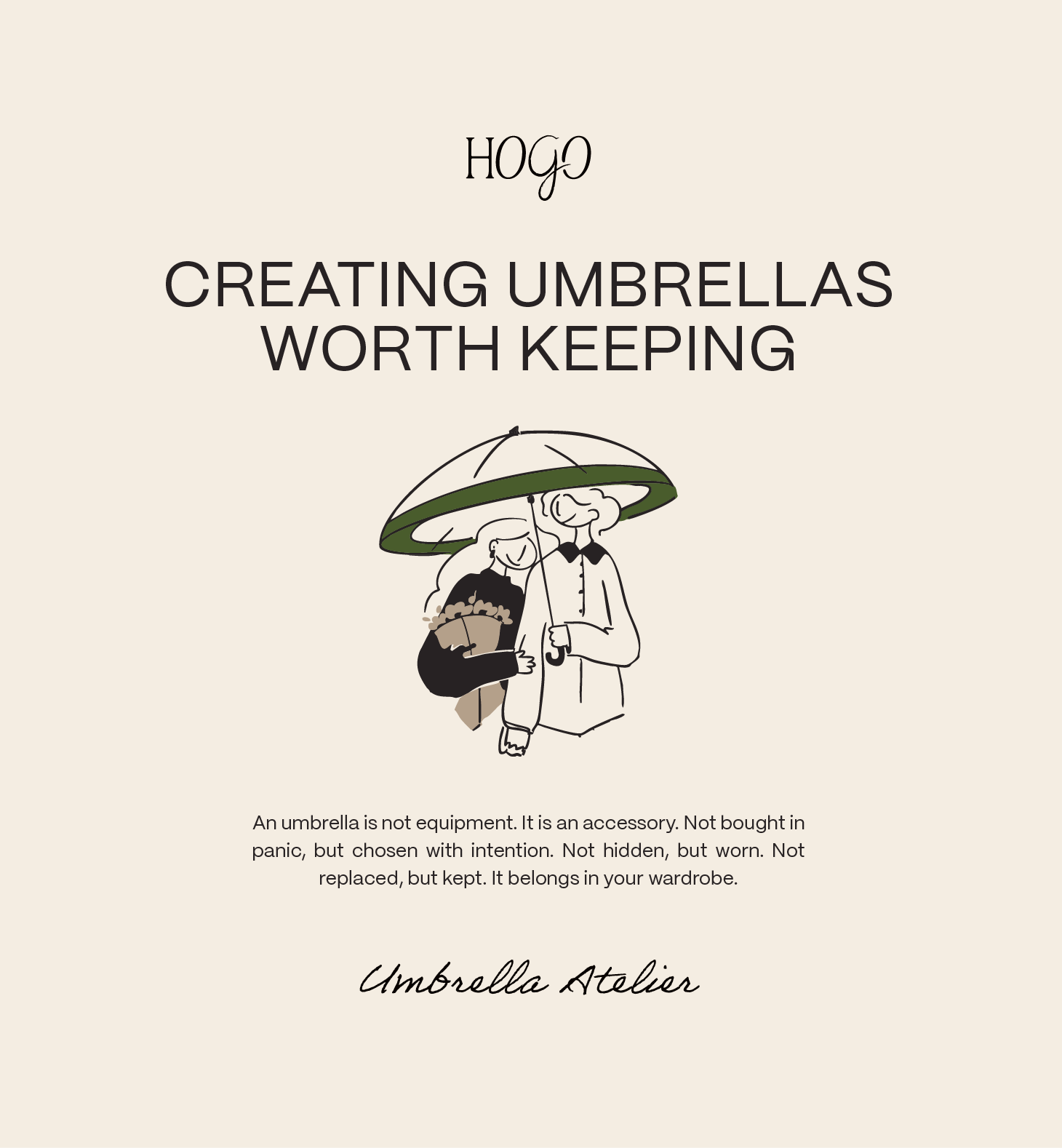
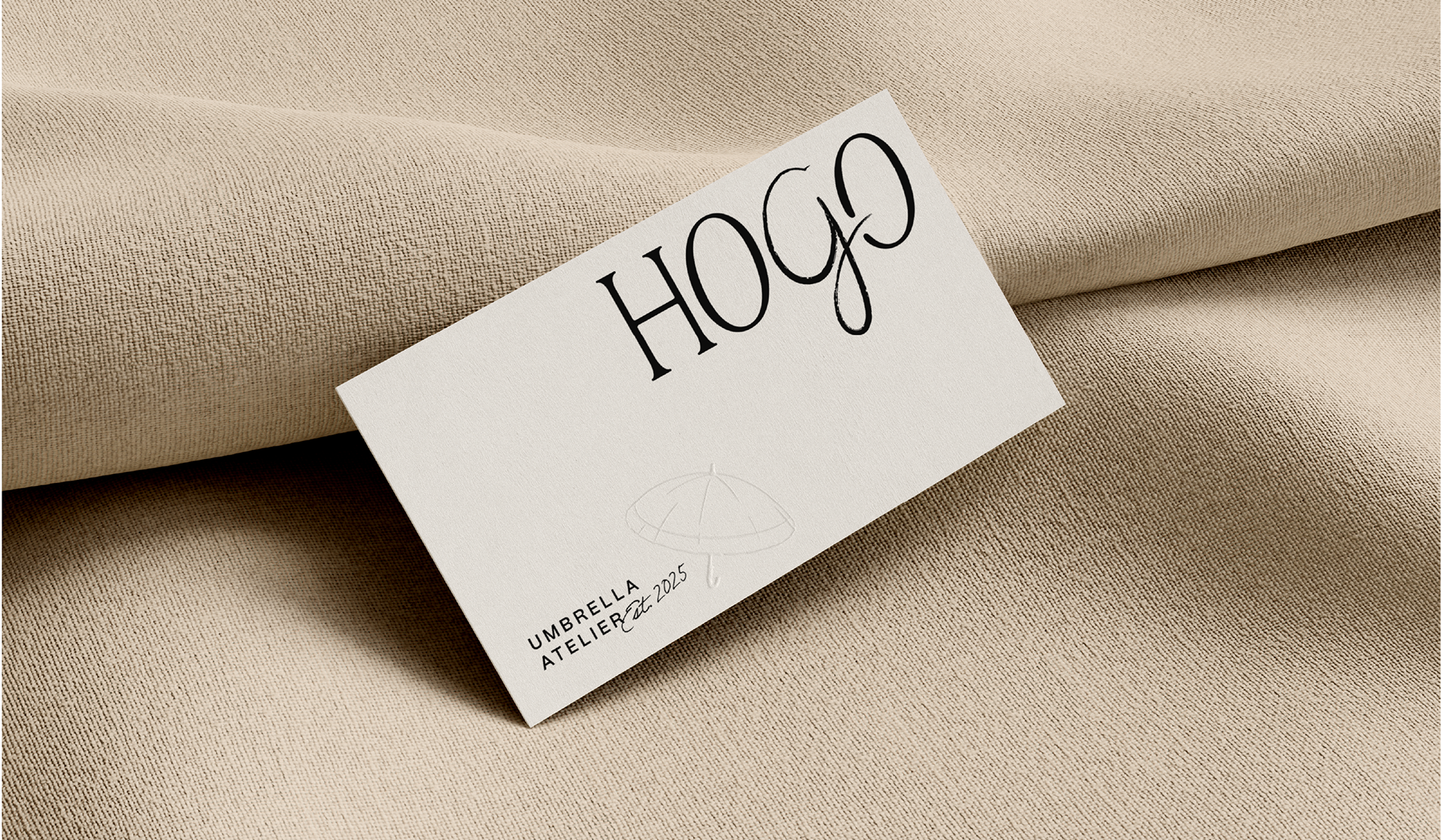
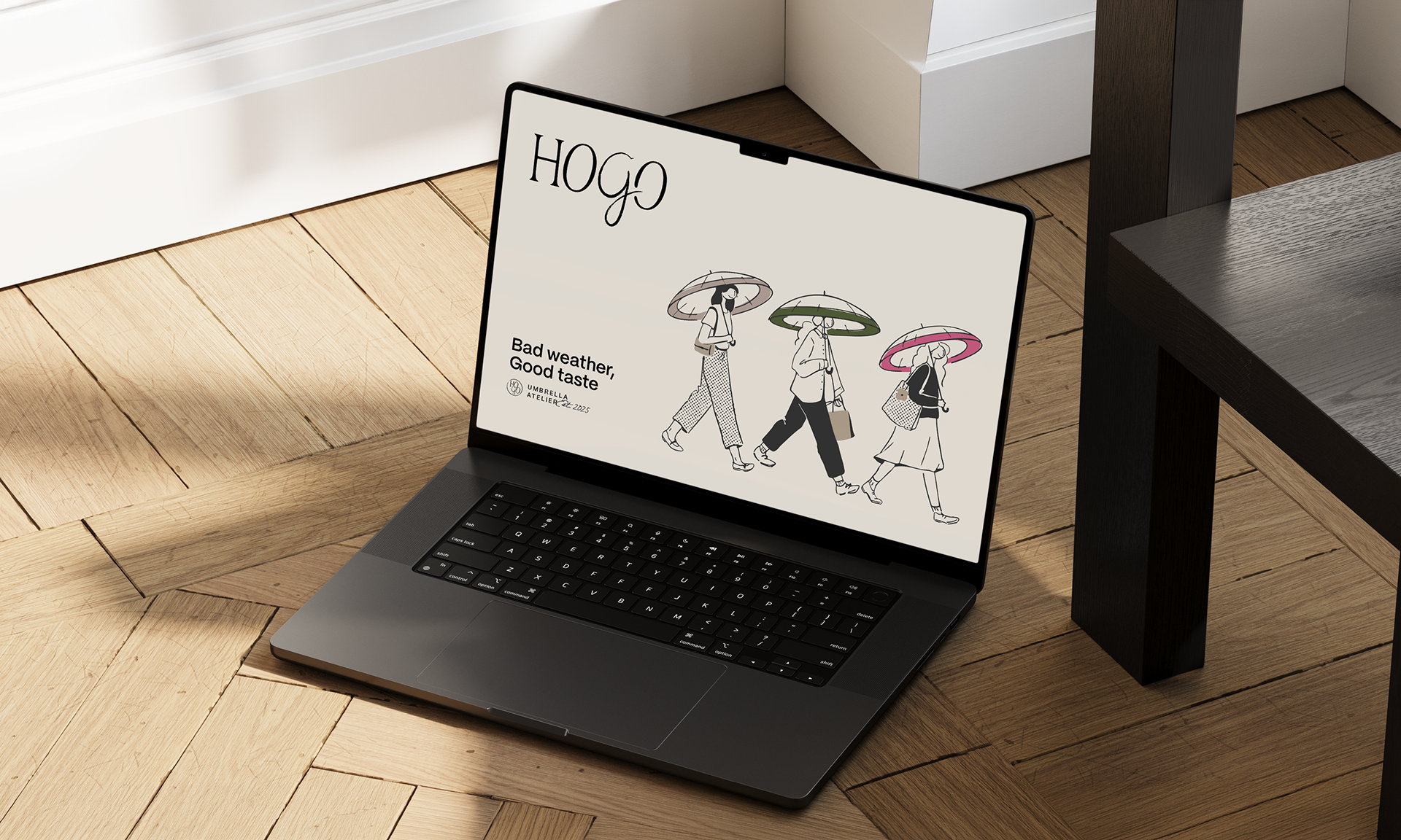
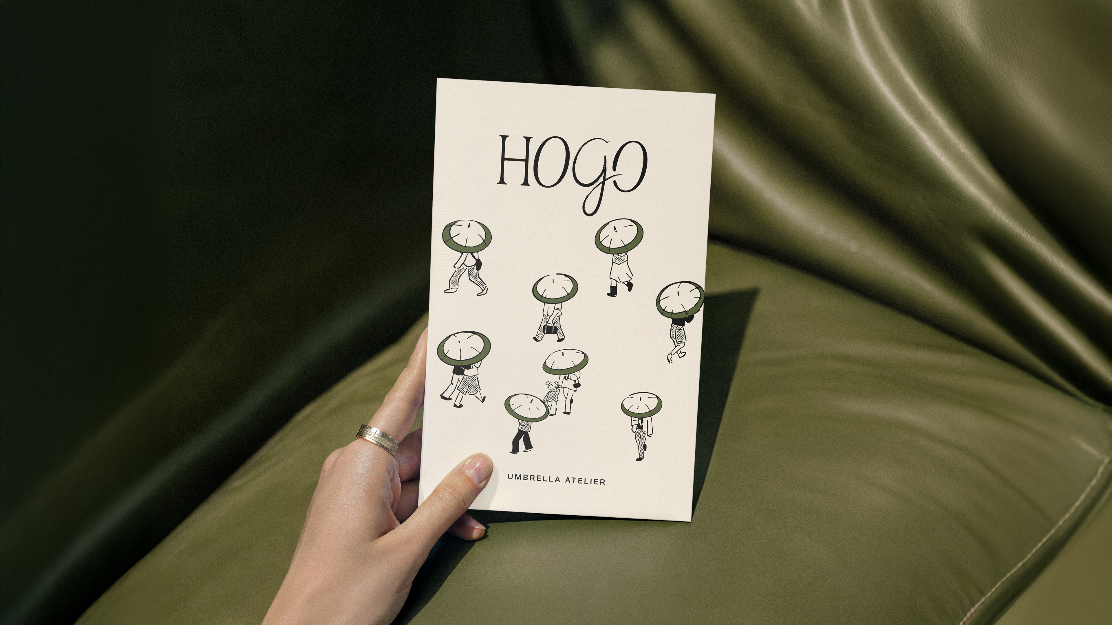
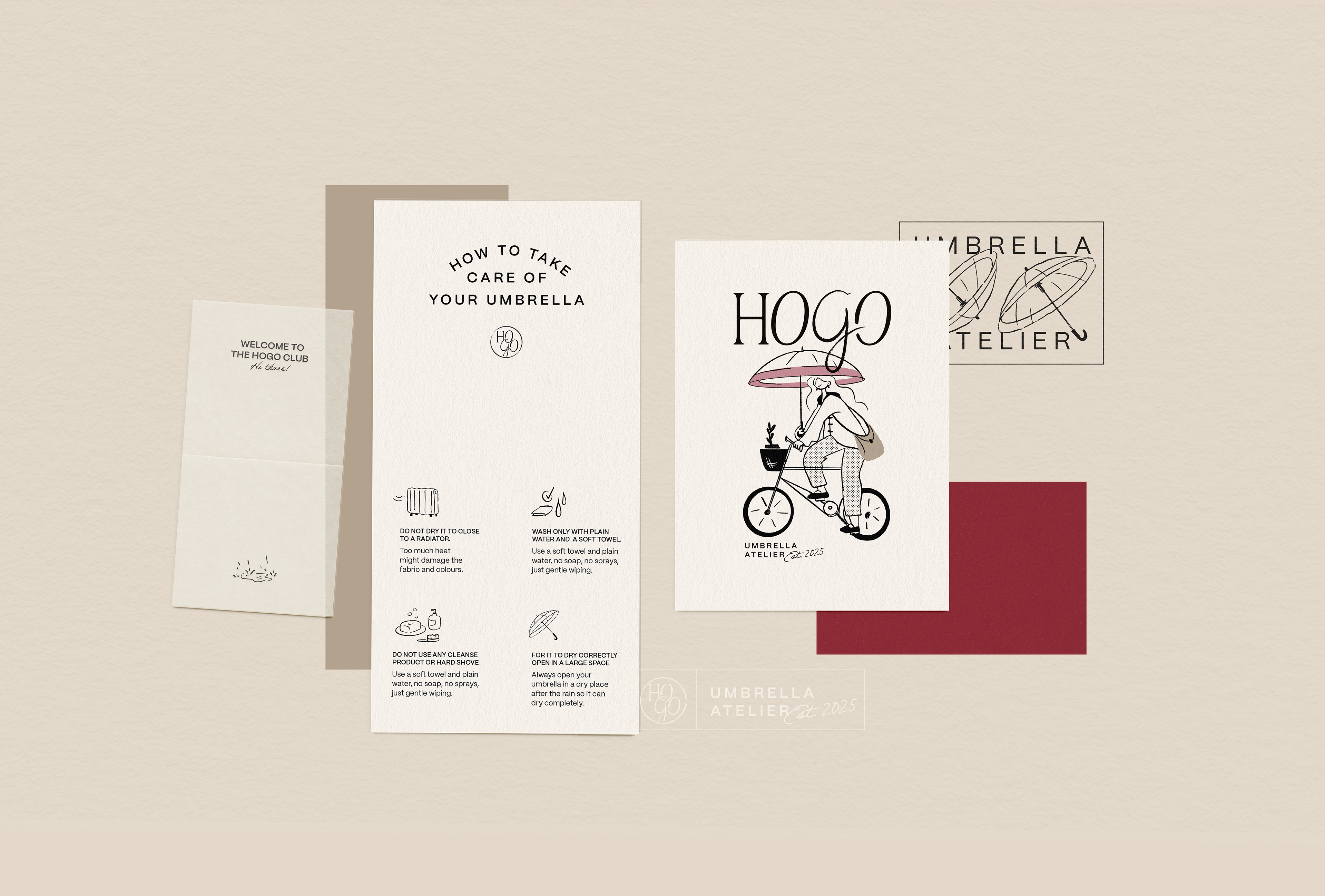
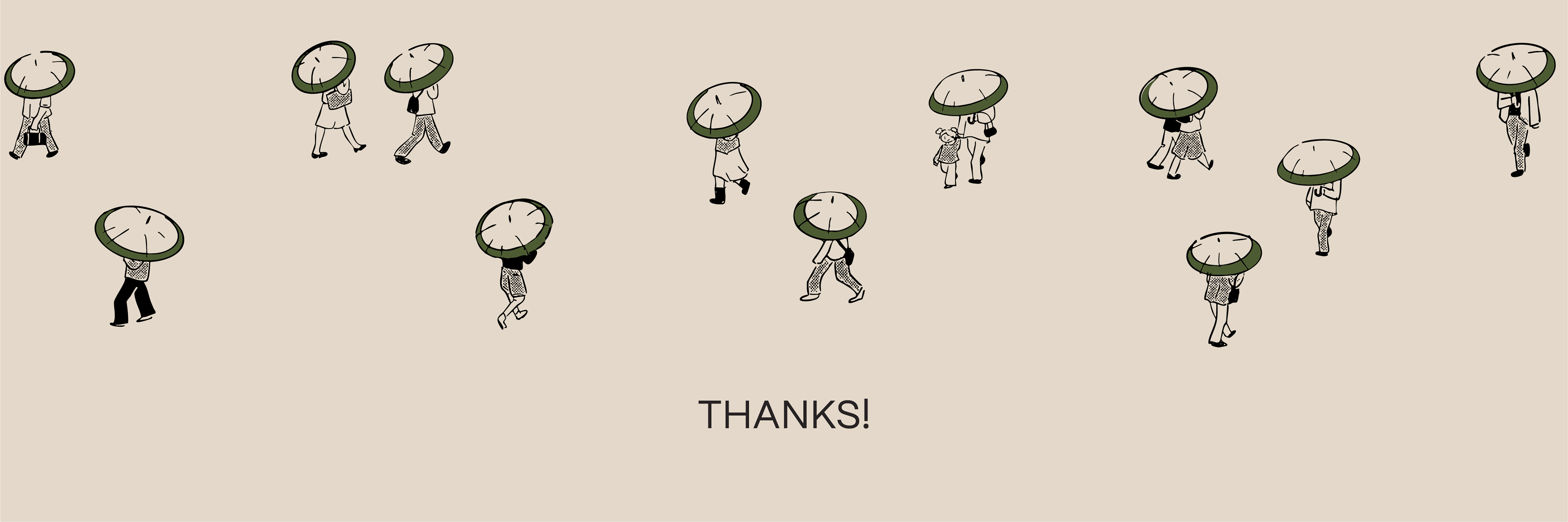
The handmade character appears in the logotype, especially in the hand-drawn “G”, while the illustrations bring movement, playfulness, and personality inspired by small poetic moments that happen in the rain.
Across packaging and communication, every element was designed to reinforce the same feeling: rain is not something to escape from, but something that can be experienced with comfort, beauty, and calm.
-
Hogo (保護) pode ser traduzido do japonês como proteger, cuidar, acolher.
Dias de chuva costumam ser associados à inconveniência, ao céu cinza e a um guarda-chuva escolhido às pressas. Hogo surgiu da vontade de transformar essa percepção, trazendo mais cor e beleza para os dias chuvosos, enquanto faz as pessoas se sentirem calmas, seguras e acolhidas sob o guarda-chuva.
Para traduzir essa sensação, a identidade visual foi feita combinando sofisticação, acolhimento e um toque humano. A paleta acompanha o próprio produto: tons neutros e quentes como base, com pequenos pontos de cor nas ilustrações e nos detalhes da marca.
O aspecto artesanal aparece no logotipo, especialmente no “G” desenhado à mão, enquanto as ilustrações acrescentam movimento, leveza e personalidade inspiradas em momentos especiais que ocorrem em dias de chuva. Cada elemento foi pensado para reforçar a mesma ideia de que a chuva não é algo do qual precisamos fugir, mas algo que pode ser vivido com conforto, beleza e calma.
Visual Identity & Illustrations: Bea Bastos
Motion Design: Bruna Cim
Brand Strategy: Rindert Dalstra
Umbrellas Studio photography: Diana Oliveira
Motion Design: Bruna Cim
Brand Strategy: Rindert Dalstra
Umbrellas Studio photography: Diana Oliveira